Today I came across a tweet comparing Miku's V2, V3, Project Diva (idk which game), and Project Sekai (PJSK) Virtual Singer design. The tweet is in Japanese and the in-built translation sucked so I'm not exactly sure what the tweet was about. But anyways, it got me thinking:
Why does PJSK Miku feel so sauceless?
And then it dawned on me.
Project Sekai VS Miku is the "evergreen" Miku design.
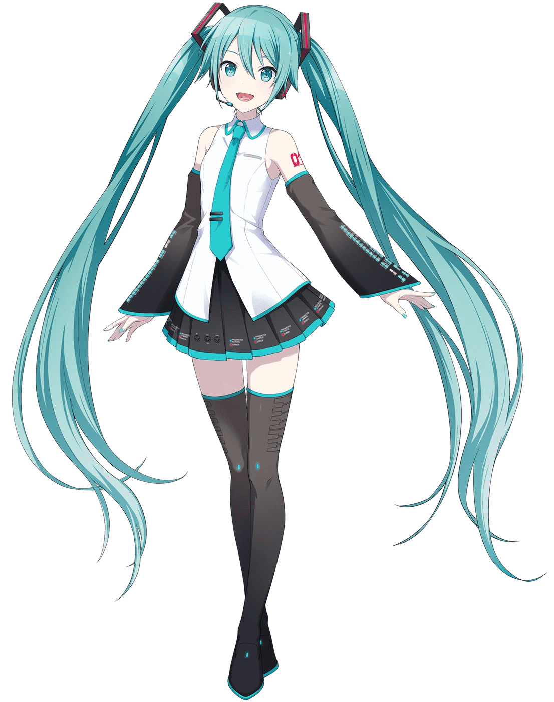
Unlike the other Mikus in the game with unique designs tailored to their group's theme, Virtual Singer Miku is kind of like the default. The design combines elements from all of her voicebank box arts—V2's hair clips and boots, the white top shirt of V3, and the rounded collar of V4. Perhaps because it's a mishmash of elements meant to represent Miku in the most general sense it almost feels... bland? Which is why I think evergreen is the perfect word to describe this design.
Maybe I should've defined evergreen first, huh. The word has many meanings, the one I'm specifically referring to is how it's used in the Transformers fandom. Per TFWiki:
In a commercial context, evergreen product is merchandise that is not "seasonal" — it can be sent to shelves for an extended period without needing to be refreshed or updated. For Transformers, this means product that is "franchiseless", not tied to any flavor-of-the-year brand like a cartoon or movie.
The consensus among fans seems to be that these designs are rather uninspiring. The most generic, if you will. And when you think of it like that, as an evergreen design, VS Miku serves its purpose well. Maybe a little too well, though. Every time I see this design of her I feel underwhelmed. The same could be said for the other Virtual Singers.
At the end of the day it's a pretty harmless design. Do I hate it? No. Dislike? Ehhhh still no. Just don't find it visually enticing/interesting, is all. On another note, damn I wish they gave her more melanin why is she so pale 😭